Why Should We Care About Pantone’s Colour of the Year 2019?
Over the past 20 years, Pantone’s Colour of the Year has been a massive influence on the world, and is used as the gold standard for creatives globally due to their extensive colour language and matching system throughout various platforms. Although the Pantone Color Institute launched the Colour of the Year back in 1999, they did not become a leading authority overnight. In fact, it is widely known that their colour picking process is founded on in-depth research and analysis.
Spearheaded by Executive Director Leatrice Eiseman, a global team of colour experts spend time and resources to uncover colour trends and influences from all facets of life. Once the data is gathered and analysed by them, the Pantone Colour of the Year is born. According to Leatrice Eiseman, the Colour of the Year already exists and their role is to simply create greater awareness.
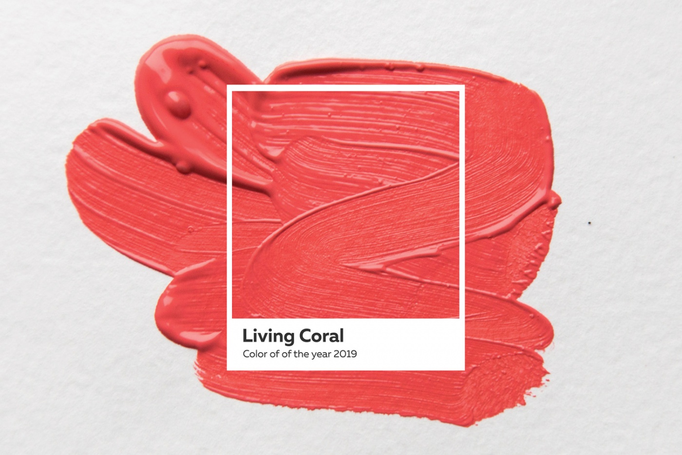
Colour of the Year 2019—Living Coral
Earlier this month, an announcement was made that Living Coral is the Colour of the Year 2019. In the official statement on their site, Pantone describes the colour as “vibrant, yet mellow” and “embraces us with warmth and nourishment to provide comfort and buoyancy in our continually shifting environment”.
Personally, I am a huge fan of Coral because of its vivacity, yet it is still comforting on the eye. And it doesn’t come as a surprise that brands are already incorporating Coral into their products—Kravet, a partner of Pantone has infused it into their home furnishings. One reason why the colour works well for interior design is because it isn’t overly bright or jarring, and exudes a sense of warmth—be it in a home or office environment.
Apple’s recent launch of their new iPhone XR also comes in a cool coral hue. Similarly, in the Marc Jacobs Spring/Summer 2019 runway show, that shade was featured prominently in several pieces. Evidently, Coral is slowly taking over the world by storm—so if you haven’t embraced it yet, it’s about time you do.


