Graphic Artist Malika Favre on Pioneering Her Own Pop and Op Art Style
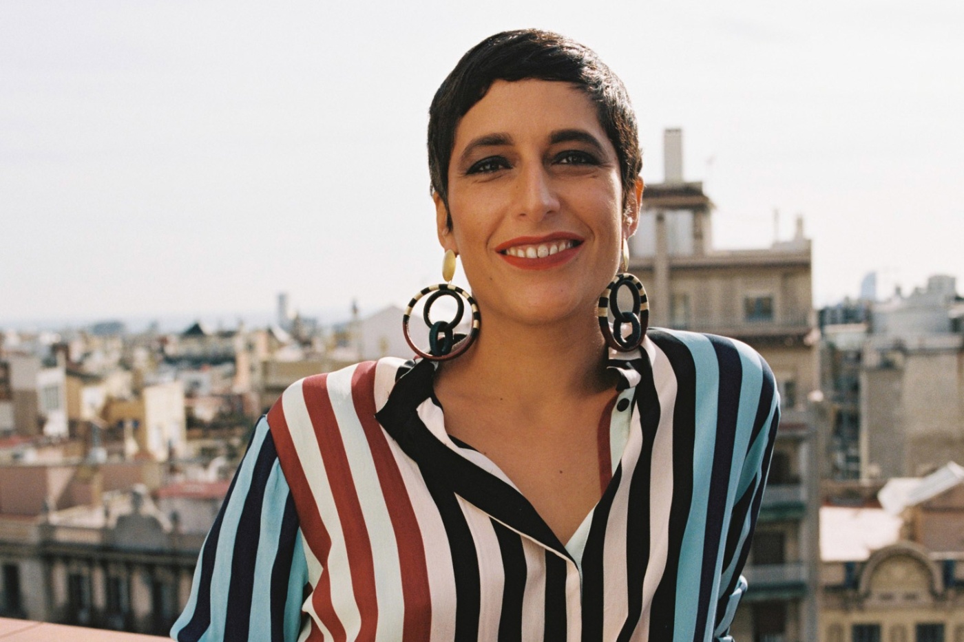
Readers of The New Yorker may have seen French graphic artist Malika Favre’s work—an iconic fuse of Pop and Op Art—on several of the magazine’s covers. It’s unmistakable, spellbinding and a vivid nod to colours. Not many are able to carve out their own niche as an illustrator, but the 39-year-old has managed to successfully do so—drawing heavily on the use of negative space, geometric shapes and the female body to create an optical effect. In fact, her stylised and minimalistic illustrations, reminiscent of both Warhol and Lichtenstein, emphasise the contrasts of light, shadow and colour and imbue a sense of drama and intrigue to an otherwise simple composition. Fresh off her latest collaboration with Louisa Parris, whose past clients include Gucci, Sephora and Penguin Books, we caught up with Favre to talk about her career, creative inspiration and developing her own unique style.
High Net Worth: You were born in France and are now based in Barcelona. What prompted the move?
Malika Favre: I actually first moved to London when I was 21 with the idea of spending a year abroad to expand my horizons. I ended up staying for 16 years. London had an incredibly exciting and vibrant creative scene back then, which truly helped me find my voice as an illustrator. It was also a very intense place where work was the core of my life. After six years of hard work in a design studio, I finally left to become an independent illustrator. A decade later, I established myself but had more work than I could handle, so I decided it was time to move again—this time to a place where I could relax a bit more and have a better quality of life. I have been living in Barcelona for three years now. The great thing about being an expat is that you always have that feeling that the world is your oyster. Once you start, you are no longer afraid of moving to a new country, learning a new language, or adapting to a new culture.
How different is the art scene in France compared to Barcelona?
Paris and Barcelona are very different cities but the people and culture are fairly similar. I haven’t really experienced the Paris art scene as I moved away so early. From an outsider perspective, I would say both cities are bursting with artists, but the economical situation in Spain makes it more tricky to thrive as an artist. Simply put, budgets are smaller and opportunities are lesser. Having an international client base was a crucial part of my decision to move there.
Does where you live bleed into your art in some form of way?
It always does. Or at least in my case. This applies not only to cities I lived in but also to places I discovered while travelling, like Mexico or Peru. I feel that the core of my work comes from the inside almost rather than my environment, though my surroundings definitely impact elements like colours, themes and my approach to light. My work in London was sharper and more graphic in a way and slowly became more curvy and organic; generous in shapes and colours after moving to Barcelona. The change might be subtle for some, but I definitely noticed it after a few years.
Your mother was a painter. Was she the first artist to influence you?
She was my hero when I was a child. She could draw, paint and sculpt so well and I wanted to be exactly like her. She is the one who taught me how to draw, look at the world and choose my colours. She also introduced me to other artists, both classical and contemporary and took me to countless museums as a child. I will always remember the day when my mum told me that I could draw better than her (I was in my twenties) and how proud she was.
Your bold, minimalistic style is often described as “Pop Art meets Op Art.” How did you come to marry the two?
Finding my style was a long and organic process. I was always fascinated by Op Art and the mathematical principles that allow it to exist. Playing with the viewer’s perception has always been something that fascinated me. Pop Art, on the other hand, was more like my guilty pleasure: the boldness, the colours, the approachability of it were what attracted me to it. A style is really the sum of its parts, of everything that resonates with an artist and shapes his or her vision. I didn’t engineer it, it just happened somehow.
As one of Europe’s most sought-after graphic artists, do you find the most pleasure in the process or the final product?
I find pleasure in both, but the final product is what brings the most joy. When I see the final image, the painful process just disappears. Simplifying is a very long and complex process that no one but me gets to experience. It is like my secret garden.
Is there a piece of artwork that you are most proud of?
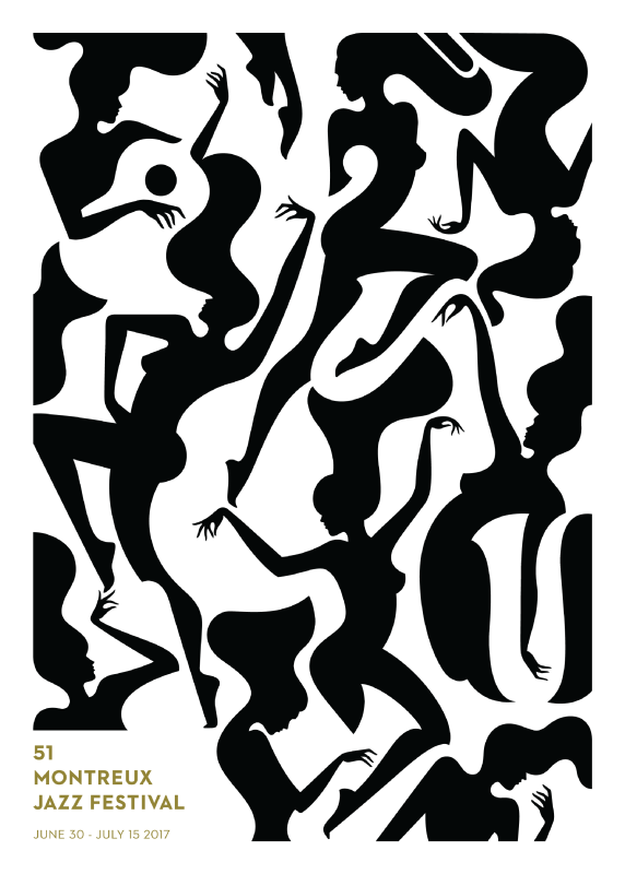
My poster for the 2017 Montreux Jazz festival is probably my favourite piece and for the exact reasons I mentioned above. I look at it today and wonder how I was able to blend the bodies and instruments together. It almost feels like a different person did it. All I remember is a feeling, almost like being in a trance.
As someone who is very sensitive to colour, what colours do you love to work with?
To me, palettes are a narrative tool, one that speaks to our emotions rather than our logic. Colours can really make or break a story. Some of my colour work is based on instinct, a blink almost but some palettes are also very thought through. I have a natural attraction to contrasting colours like black and white, and clashing colours like red and blue. I’m not sure where it comes from, but I learnt to trust my colour sense in a way. I have never been attracted to pastels or washed out palettes; I respond to bold and unapologetic colours.
Your work also demonstrates a deep understanding of how light and shadow work. Is there some sort of ratio you have perfected with each piece to incorporate those elements?
Understanding how light and shadow work comes from constant observation of the world. They are the basic elements to learning about perspective and depth and my most important tool when it comes to paring down complex scenes. Actually, I often look at lights and shadows as colours rather than anything else.
When you do research for your projects, you mentioned how you like to look at “bad photography.” How does that inspire you?
I was referring to images for specific elements of a scene in this case. Like the position of a hand, the direction of light or shadow and the proportions of a building. When I am researching such specific information, the quality of a photograph is irrelevant and can even get in the way if it influences your vision too much. These “generic” images function as a library rather than a mood board.
Does your love for film influence the way you compose your work too?
My fascination for movies has a huge influence on how I compose my images today. I grew up without a TV but watched a lot of old Hollywood and noir films with my family. I love using unexpected angles and very cinematic compositions.
When do you know your work is done?
I just know—I can’t really rationalise it. I build my illustrations line by line, perfecting each one as I go and then moving on to the next shape. I rarely go backwards and eventually, after hundreds or thousands of micro-decisions I get to that final line.
Do you think life imitates art or is it the other way around?
I think it goes both ways, like a circle.